Kazoo Design System
Kazoo aimed to merge two existing applications into a single consolidated SaaS platform. Without a structured plan of attack and a cohesive design system, such a project can quickly become messy.
Each existing application had its own visual styles and components. My role was to unify them by creating a new design system that standardized all components and achieved the visual style of Kazoo. Building a new design system is a challenging task, but the benefits it provides are worth the time invested.
Project details
My role
Document all existing styles and components from the two existing applications. Establish design principles to create standardization across new components and visual styles under Kazoo branding. Design components to be fully accessible to accommodate all users. Work with development to build and maintain the library.
Other contributors
Design Director, Product Designer, Development, QA
Duration
4 months + continual iteration
The goal
The goal was to build and document a cohesive system for designers and developers. This system would create consistency across all products, increase internal efficiency, and improve usability.
The problem
The two existing applications that were merged into the new Kazoo platform were on different backend technologies with very different UI styles, patterns and elements creating inconsistency and a friction-filled experience for our users.
The process
Taking inventory
One of the first tasks to start this journey was to take inventory of every UI element in both existing applications. We took screenshots of every page, every design pattern, every modal, etc. Next came divvying up recreating them in Figma.
UI Audit
Once we captured all design elements from both applications, we grouped them into categories. Having design elements from 2 different applications and viewing them side-by-side revealed exactly why we needed a system. There were inconsistent UI styles, several versions of the same component, and one-off elements that needed to be reconsidered.
Standardizing and principles
Aligning and standardizing with:
Engineering - on naming conventions, accessibility requirements, and file structure to help work cohesively and prevent errors
Marketing - on visual elements like icons, colors, typography, etc. to encompass the personality of Kazoo
Building the components
Weekly meets with front-end developers for design system grooming to discuss the components and how we’ll approach building them.
I maintained a backlog of tickets for the design system. When a developer picked up a ticket, we worked closely to make sure both the UI, interaction design, and naming conventions translated to the built component.
Inspiration
Atomic design principles
Favorite resources and examples
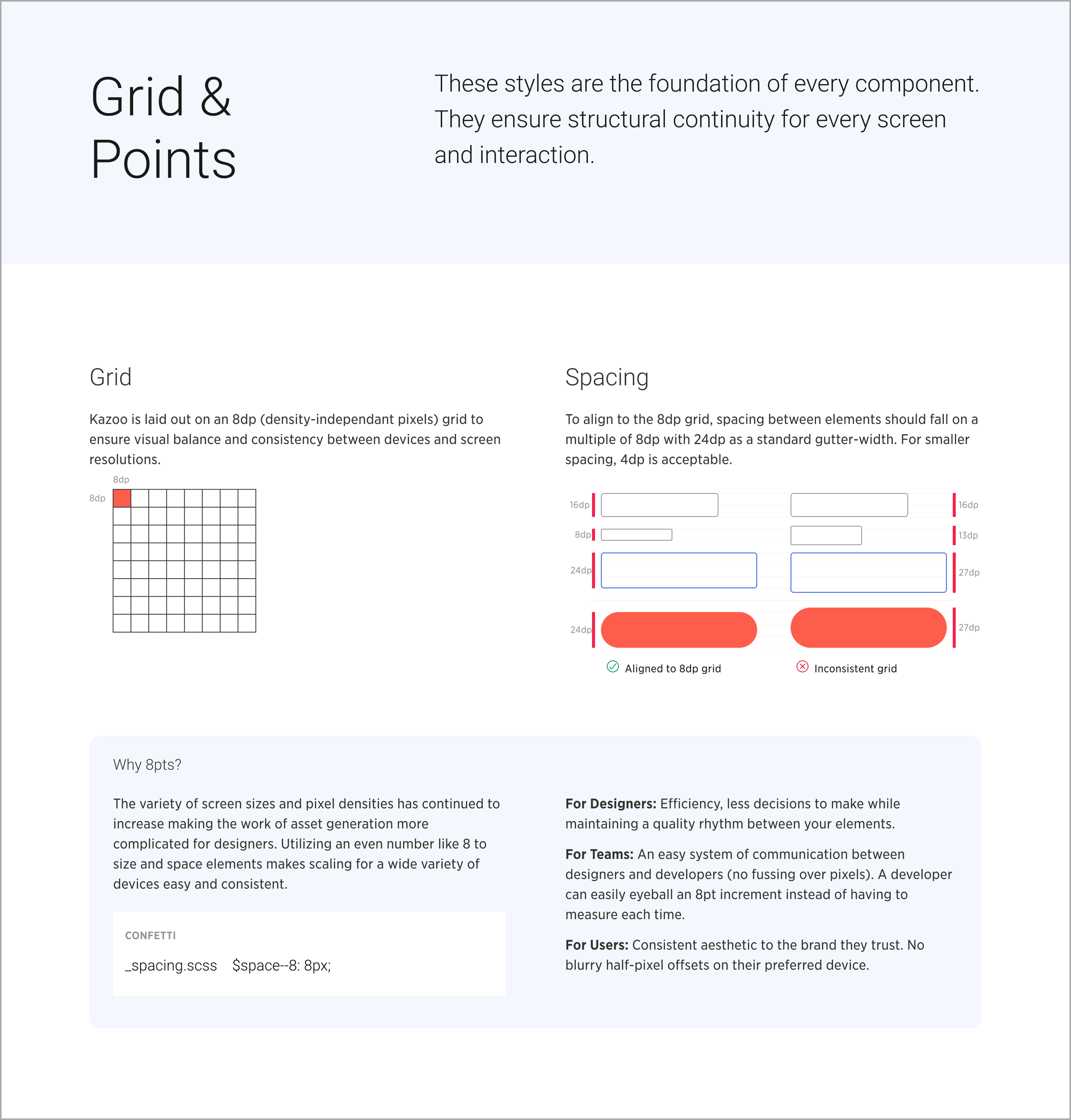
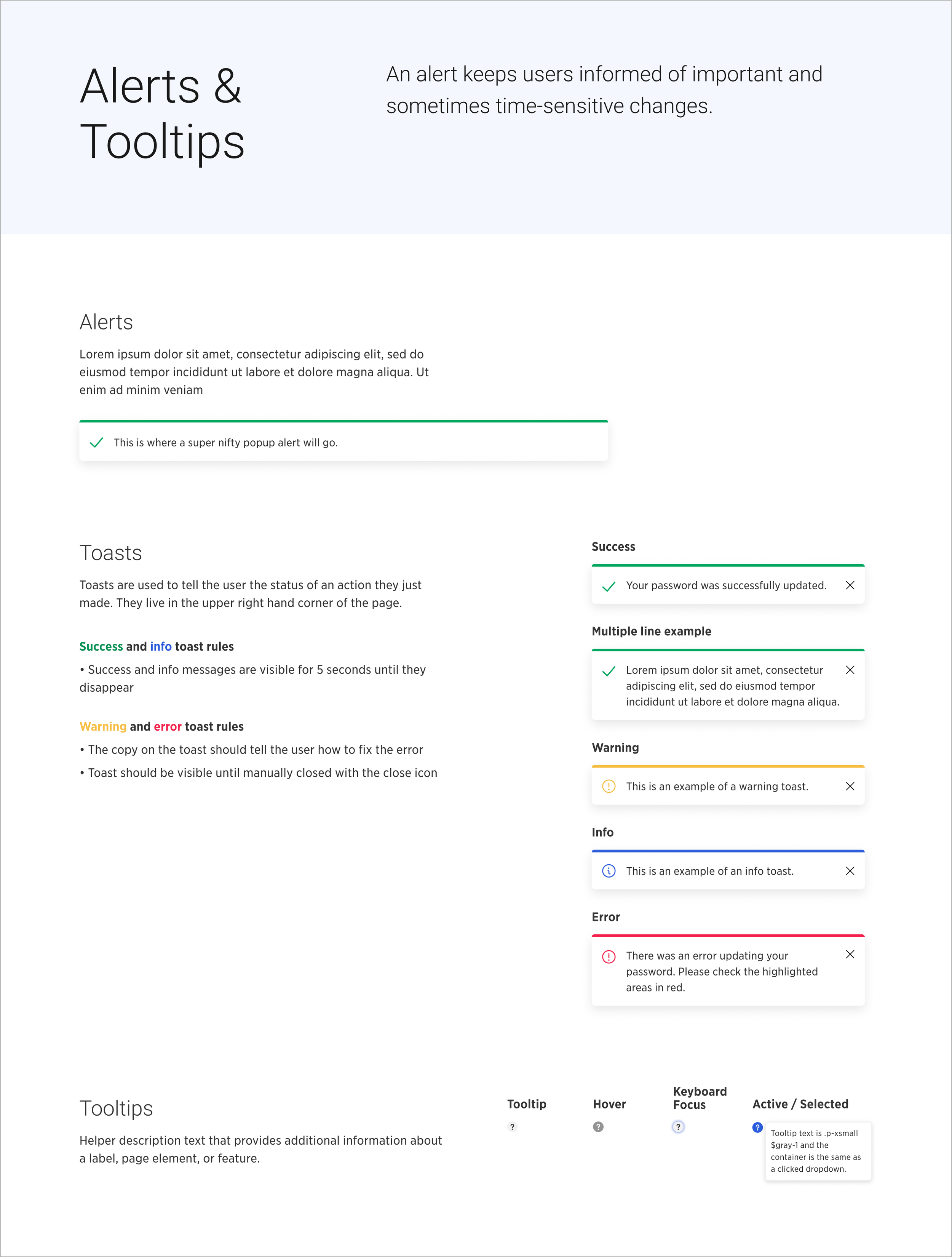
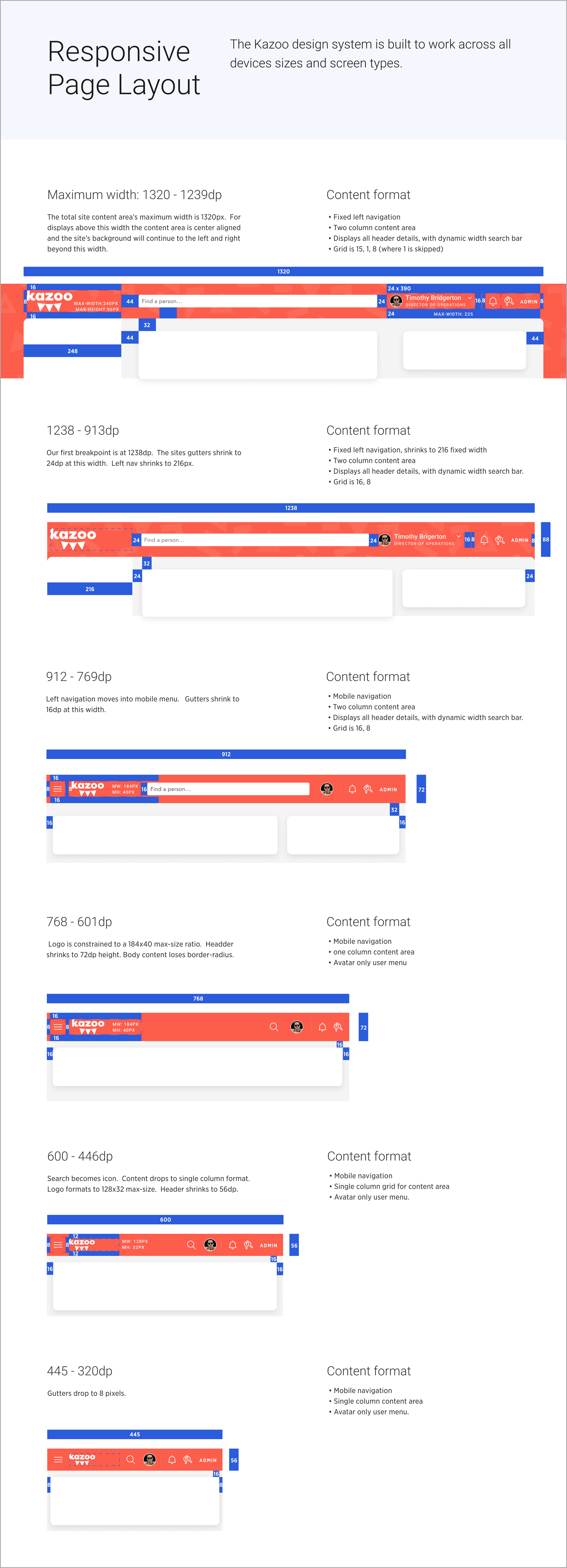
Kazoo’s Design System: Confetti


