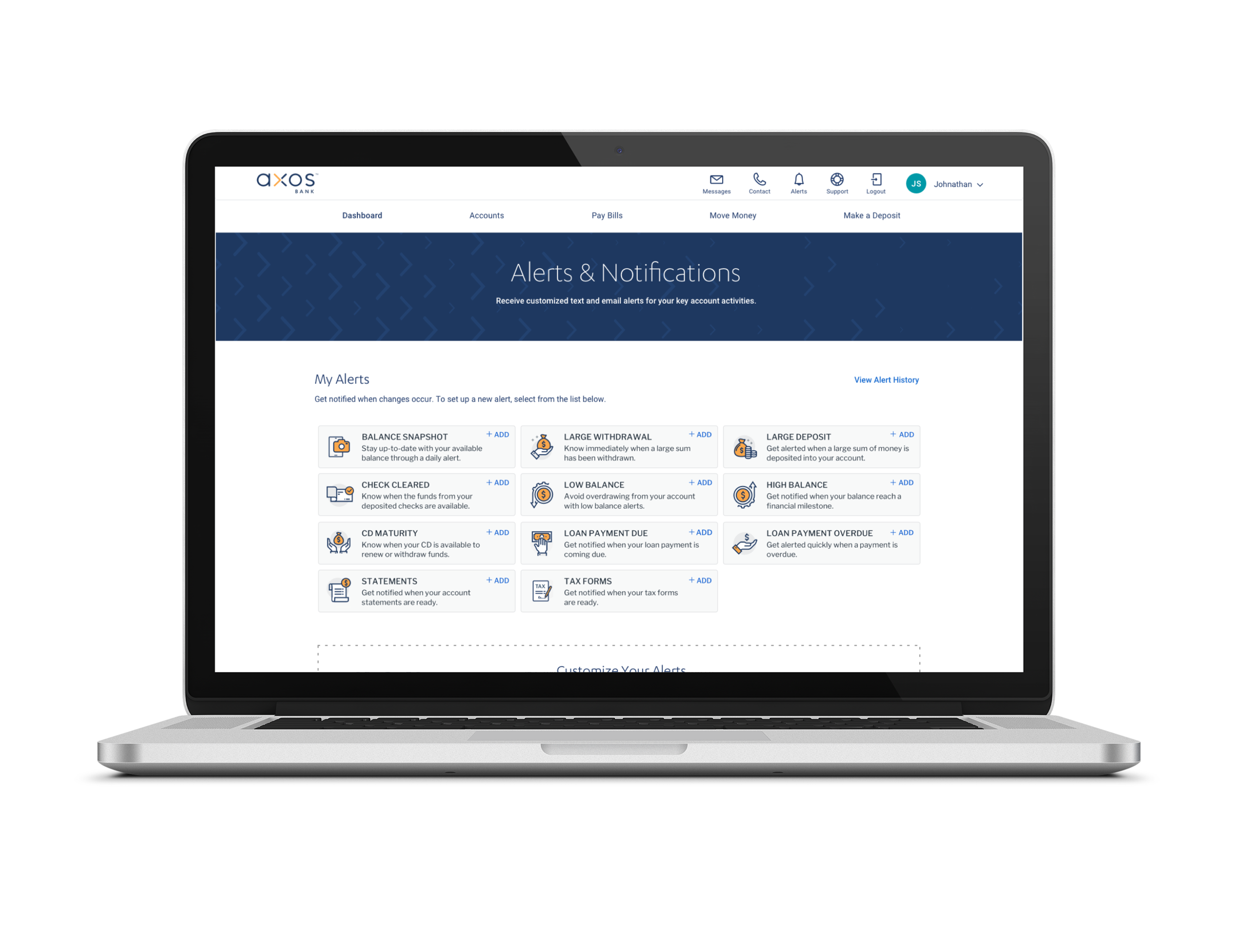
Axos is a FinTech company that supports consumer and business banking with a large variety of deposit and lending products tailored to specific needs.
Project Team
Lead designer (Me)
Project Manager
Stakeholders
Engineering
My role as Design Lead
UX Research
Ideation + facilitate design workshops
Wireframes
Creative direction
High-fidelity mockups
Usability testing
Design QA
Iterative improvements
What is Axos Universal Digital Bank?
Axos Universal Digital Bank is an online banking platform that is fully responsive, mobile-friendly and ADA compliant. It caters to a broad spectrum of people, from the everyday person with simple banking needs, to the business owner with more specific needs. This platform allows customers to consolidate their banking information by aggregating all of their accounts into one place. The main dashboard is customizable with “tiles” that can be moved around and organized to the customer’s liking. They are able to add or remove tiles from the Tile Store, which features add-ons like Personal Finance Management, Quick Transfer, Insights, Account Trends, and Scheduled Payments.
The goal
To conceptualize, design and build an innovative online banking portal that caters to a broad spectrum of people, from the everyday person with simple banking needs, to the business owner with more specific needs.
Design Process
This is a high level view of the design process that the design team and I followed throughout the Universal Digital Bank project. For each feature, I tried to stick with a similar process to below, but with time constraints and testing budget, some steps unfortunately got missed. The design team made the best out of the time and resources we had.
Research
Stakeholder interviews
Gain insights through different perspectives within the company
Involve other departments in design process
Customer interviews
Who?
8 existing Customers
Select a broad range of customers from basic account users to high net worth users with more advanced needs
Why?
To listen, learn and discover
Gain qualitative insights to influence design direction
Make sure we are solving the right problems
Discover our user needs that should be met
Validate we are building a platform that provides value
How?
Create a structured outline of questions within a 30-minute time frame
Pull questions from credible sources like NNG or usability.gov and tailor them to our product
Competitive analysis
Each design team member contributed to researching competitors in the FinTech and online banking industries
Printed off screenshots from each competitor and posted them all on a wall
Analyzed and compared competitors’ content and determined where we fall in relation to what they are doing
Personas
The design team worked together to come up with a group of personas based on information and qualitative data from interviews and gatherings from market research
Brainstorming workshops + wireframes
My Design Director conducted a 2 hour workshop and each team member was to do prior research about online banking to inspire ideas. In the session we each wrote down ideas on sticky notes for the dashboard concept — no idea was a bad idea! We then grouped all of our ideas and organized them into buckets and themes. After logging down everyone’s ideas, I was inspired and able to draft a few different versions of wireframe concepts to present to Stakeholders and Executive team.
What I learned
Customer interviews and feedback are so valuable — looking back, I would have conducted customer feedback at the wireframe stage in addition to feedback on the high fidelity prototype. Feedback at the wireframe stage would have made the high fidelity revisions less cumbersome
It is crucial to think about a product with a holistic vision, instead of thinking feature by feature or page by page
Even being a designer, it is important to be business-minded and be able to work with data and different business units to improve the product and gain different perspectives


